Yoga Fitness series
4.5/5.0 Debut Rating | 5% Packaging Volume Reduction
Greater Goods ventured into the fitness category with a new yoga series in late 2021, featuring a yoga mat, strap, and block. I led the entire product and packaging design, closely monitoring the prototyping process. My focus was on ensuring CMF (Color, Material, Finish) consistency, particularly in matching colors between the yoga mats and blocks despite their different materials. To enhance the kit's value, I designed an innovative yoga strap that functions both as a stretching band and a carring strap. Additionally, I created unique packaging to enhance the customer experience by providing an engaging unboxing experience.
Client
Greater Goods
Role
Product Designer
Services
Product Design Package Design Project Management Product Development
Industries
Fitness Product
Date
July 2021
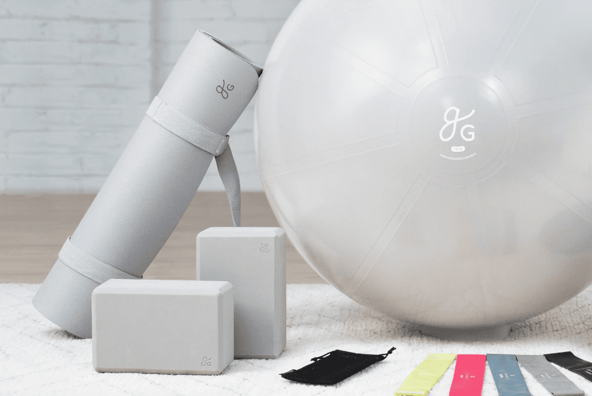
Major Challenges: 1. Design & Branding consistency 2. Ensure design and branding consistency while balancing good design with eco-friendly and cost-saving considerations for both the product and packaging. 3. Address and manage chromatic aberration issues from various OEMs, and rigorously test products before mass production.

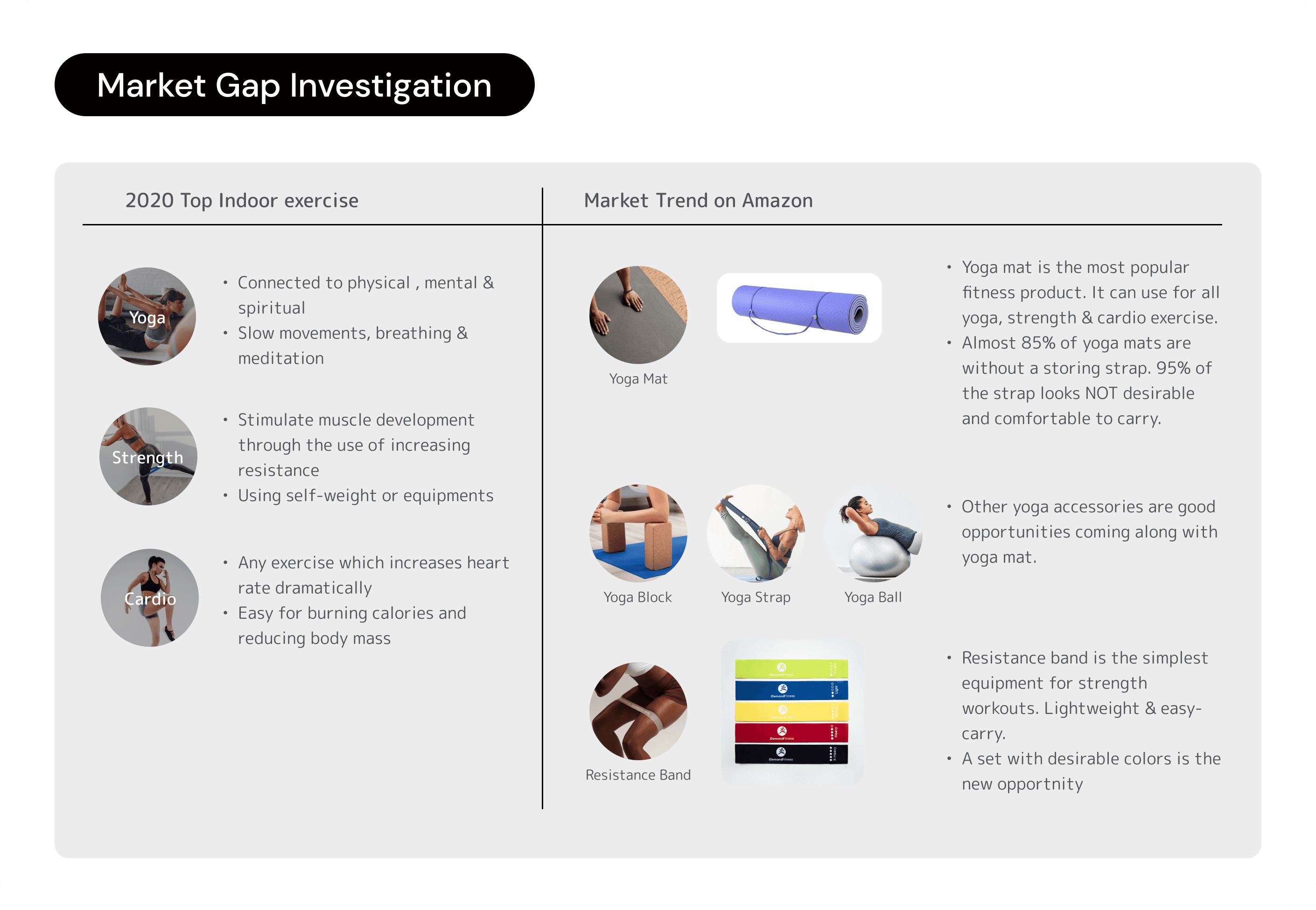
In 2020, the COVID-19 pandemic prompted a shift to indoor exercise, with Yoga and Strength & Cardio topping the list, as reported by NDTV. This led to a notable surge in online training classes and a high demand for home fitness equipment on platforms like Amazon.

As newcomers to the fitness industry, we embraced an agile development process, exploring materials and manufacturing methods while sketching ideas and creating prototypes—a departure from our previous projects. After investigating various materials, we chose TPE for our yoga mats due to its superior non-slip friction and lightweight, which helps reduce shipping costs. For the yoga blocks, we compared LDPE and EPP, ultimately selecting LDPE because EPP appeared cheap and did not align with Greater Goods’ branding image.

Greater Goods' design direction is guided by three key principles: alignment with GG's branding and aesthetic, a focus on practical functionality over unnecessary decoration, and a strong emphasis on cost awareness. Amid the pandemic, people experienced feelings of depression due to restrictions on outdoor activities. This cheerful and bright color palette aims to provide a diverse and mood-enhancing range for our customers. Recognizing a higher proportion of female customers, we selected two feminizing pinks, along with middle-gender and basic colors like black and grey. Success in a new product category hinges on more than just an appealing appearance. The entire design process is intricately connected to branding, quality, functionality control, and cost-effectiveness.

The pattern and texture of a yoga mat are crucial for optimal friction in various poses. To make Greater Goods brand memorable, the distinctive pill-shaped pattern from the original branding is the primary texture. During prototyping, we tested various pattern scales, debossing, embossing, and bump heights to balance visual appeal and functionality. In the prototyping process, we tested various pattern options with different scaling levels, debossing, and embossing results, as well as pattern bump heights. We aimed to strike the right balance between visual appeal and functional effectiveness on the yoga mat.

Recognizing that most yoga mats lack a quality storing strap, we saw an opportunity to add value for our customers. Our unique storing accessory, included with Greater Goods yoga mats, combines the functions of a yoga strap and a shoulder carrying strap. With an adjustable metal ring, it adapts to various lengths and securely holds the mat in place, preventing it from falling off. This thoughtful design enhances both the practicality and value of our product.

In the fitness kit, the yoga block is a bonus if it meets basic requirements for support and hardness in various poses. We tested products with different densities to find the ideal support. Since adding a logo via laser on the LDPE block was difficult, we opted for a debossed logo instead.

